Shades of meaning: visualising geographical data with colour in a data-driven web application
Colour and maps are two crucial aspects of data visualisation, and putting them together is a classic technique for revealing geographical patterns in data.
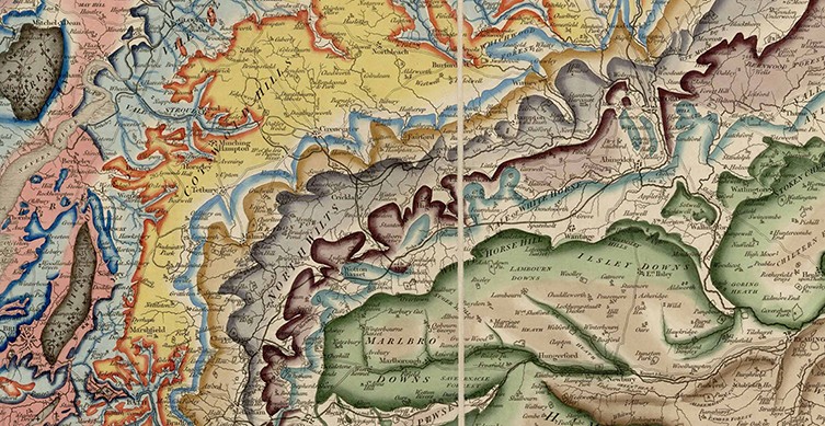
William Smith's geological map of 1815
If data values are discrete, selecting the colours to use is straightforward - just choose an appropriate colour for each value. For continuous data, a colour scale is required, where any numeric value in the data range can be mapped to a colour, and where the gradations in colour are visually meaningful.
This is fine for a pre-canned visualisation which can be tailored to the data, but trickier in dynamic applications with data whose extents are not known in advance. Pre-defining a colour scale which will be appropriate for all possible datasets can be problematic, as we discovered when we developed the web application part of the Naomi project for estimating district-level HIV indicators in sub-Saharan Africa.
This app provides choropleth maps for users to see how epidemic indicators like disease prevalence vary by area. Choropleths are maps whose regions are coloured to show data values as shades on a colour scale. The application is designed so that metadata defining data formats and presentation originate in the research code. This metadata includes the colour scales which the maps use to display regional data.
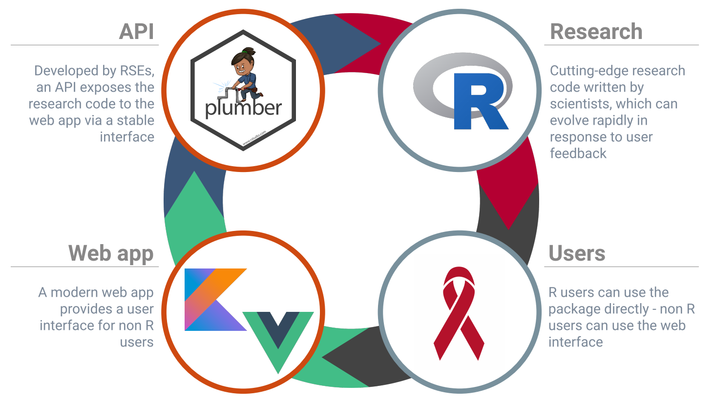
Naomi architecture
This approach allows for a flexible, iterative workflow where scientists developing research code can experiment with new data series, model parameters and visualisation settings without requiring further development from the web application team.
New versions of the research code and API can be deployed, which include changes to data, metadata and research model, without needing to redeploy the web application to handle these changes. Metadata is fetched for each new user session, and the web app deals with whatever combination of data and metadata it receives.
The relevant parts of the metadata for our choropleths are, for each indicator:
- Colour scale: a named colour scale from d3-scale-chromatic. Each scale provides a method for mapping values between 0 and 1 to a colour. For example here is the interpolateViridis scale:

- Reverse scale: boolean indicating whether to reverse the colour scale i.e. map each 0-1 value to the scale’s value for 1-value.
- Min and max: the expected min and max values for the indicator. These are mapped to the 0 and 1 values of the colour scale, and data points between are mapped to values between 0 and 1 by interpolation.
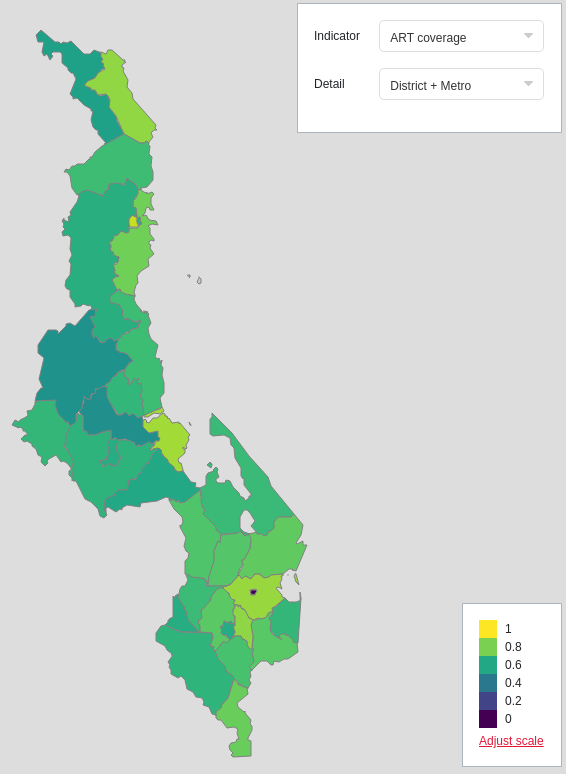
A choropleth in Naomi showing district-level ART (antiretroviral therapy) coverage using the interpolateViridis colour scale
However we found that, while this approach was a powerful way for researchers to define how data should be visualised, it was not sufficiently flexible to give users the best results for all views of all datasets.
The min-max ranges defined by metadata may not be wide enough to capture all values in a particular view of a dataset, in which case all values which exceed that range will be assigned the same colour, and hence be indistinguishable. Conversely, if a default range is too wide, and all values are clustered within one area of the scale, these may also be difficult to distinguish visually.
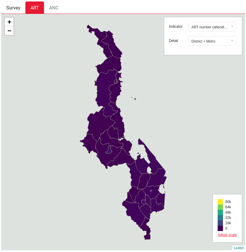
A choropleth with an inappropriate default scale: all areas appear as the same colour even though their values are different
The reason why scales defined for a dataset are often inappropriate for a particular view of that data is that our choropleth data is always a filtered subset of a full dataset, providing a view of values for a particular age range, year, etc, where the user can change which filter set to display using drop-down controls. The metadata range provides a colour scale which is consistent - the same colour corresponds to the same value for each set of filter values. However we found that some filter sets would typically exhibit much narrower indicator ranges than the whole dataset, so that the map rendered could be of little use as a choropleth.
To solve these issues, we implemented a set of options allowing the user to control the colour range dynamically:

These are:
- Static
- Default: use range from metadata
- Custom: user selects arbitrary values for range
- Dynamic
- Entire dataset: Use min and max values in actual (unfiltered) dataset
- Filtered dataset: Use min and max value in actual dataset, filtered by the current filter set.
Here’s an example of how ‘Entire dataset’ differs from ‘Filtered dataset’. In these two images, the colour scale fits the entire dataset, hence is consistent across all filter sets. This means there is typically less colour variation for a given set of filters, but since the colours are fixed to the same values across all sets of filters, it is easy to visually compare the values across both filter sets.

In the next images, the same two filter sets are shown with ‘Filtered dataset’ selected. The colour scale is fully used for each filter set so the contrast across shades on the map is maximised and colours are easier to distinguish. However, because the ‘meaning’ of each colour changes across filter sets, different filter sets cannot easily be visually compared. So this may be a more useful option when the user is interested in examining a single filter set.

With the option to set the range to arbitrary custom values, users can change the colour scale on the fly to suit their purposes. For example, they may wish to manually narrow the range to maximise variation in a particular area of the map:

There are many further options which could have given the user additional control, like choosing a different colour scale entirely, or selecting new start and end points within a colour scale. However, we needed to balance user control with a simple, intuitive interface covering the majority of use cases.
While researcher-defined default colour ranges remain a good starting point, these additional options improve the utility of Naomi’s maps by giving the user more flexibility to explore different aspects of the data, and can reveal insights about particular datasets which could not be predicted by a colour scale defined by generic metadata.


